You’ve finished designing a vibrant flyer—then printed it, only to find the blues are muted and the greens aren’t as bright. This is why we ask for your artwork in CMYK before printing. What happened?
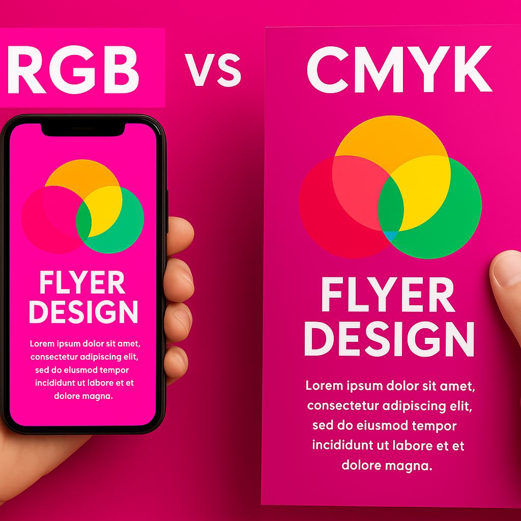
This disconnect often comes from using RGB, which is optimized for screens, instead of CMYK, the color mode printers require.
At Siang Heng Printing Services, we help customers resolve this mismatch early—so their prints come out vibrant, not dull.
🌈 RGB vs CMYK: What’s the Real Difference?
| Mode | Used For | Created By | Result |
|---|---|---|---|
| RGB | Screens (phones, monitors) | Light (Red, Green, Blue) | Bright, saturated colors |
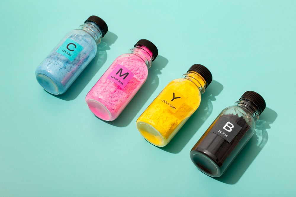
| CMYK | Print (flyers, namecards, stickers) | Ink (Cyan, Magenta, Yellow, Black) | Realistic, accurate printed colors |
Key Point: RGB colors sometimes can’t be replicated in ink—especially neon greens, bright blues, and vivid purples. That’s why converting your file to CMYK is essential before printing.
👀 Real-World Example
- On-screen: a glowing lime green logo
- In print: it appears dull and olive-toned
RGB’s vibrance comes from light emission—CMYK blends ink, which behaves very differently.
🛠️ How to Convert Your File to CMYK
In Photoshop:
Image > Mode > CMYK Color
In Illustrator:
File > Document Color Mode > CMYK Color
In InDesign:
Choose CMYK during document setup
In Canva:
Download as “PDF Print” – optimized for printing though limited CMYK control
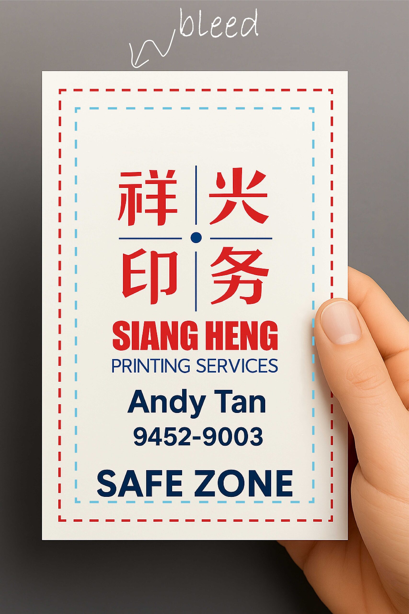
Also ensure your file is at 300 DPI with bleed and crop marks if trimming is required. Submitting artwork in CMYK from the start avoids costly reprints.
🧪 Tip from Siang Heng
Still unsure about color accuracy? Upload your file to our flyer printing or any product page—we’ll do a free file check and advise if CMYK conversion is needed. That way, your brand colors stay consistent across digital and print.
✅ Summary Checklist
- RGB is for screens; CMYK is for printers
- Convert your files to CMYK before final export
- Preview your design using print-safe colors
- Ask us for a test print if you’re unsure
Your branding deserves vibrancy—submitting your artwork in CMYK helps deliver that reliably on paper. For more on how the CMYK color model works, see this reference guide.
👁️ Why Some Colors Can’t Be Printed Without Artwork in CMYK
RGB screens create color using light, which allows for an extremely wide range of vivid, glowing tones. CMYK printing uses layered ink dots, which physically can’t reproduce certain neon or fluorescent shades — no matter how the file is converted. This is called being “out of gamut.” If your design relies on a specific bright color, the closest CMYK equivalent will usually appear slightly more muted or shifted in tone. Knowing this in advance helps set realistic expectations before your file goes to print.
❔ Frequently Asked Questions
Why does my logo look duller in print than on screen?
This usually happens when a bright RGB color falls outside CMYK’s printable range. The ink-based equivalent is the closest achievable match, which can appear slightly less vivid than the on-screen version.
Should I convert to CMYK myself, or can Siang Heng do it?
Either works — if you’re comfortable in Illustrator, Photoshop, or InDesign, converting yourself gives you more control over the final look. Otherwise, just send us your RGB file and we’ll convert it and flag any major color shifts before printing.
Does this affect black and white designs too?
Less so — pure black and greyscale tones translate fairly consistently between RGB and CMYK. Color mismatches are mostly a concern for saturated, bright, or neon colors.